
Certainly! Here are 11 techniques for developing a WordPress site that is responsive to mobile devices.
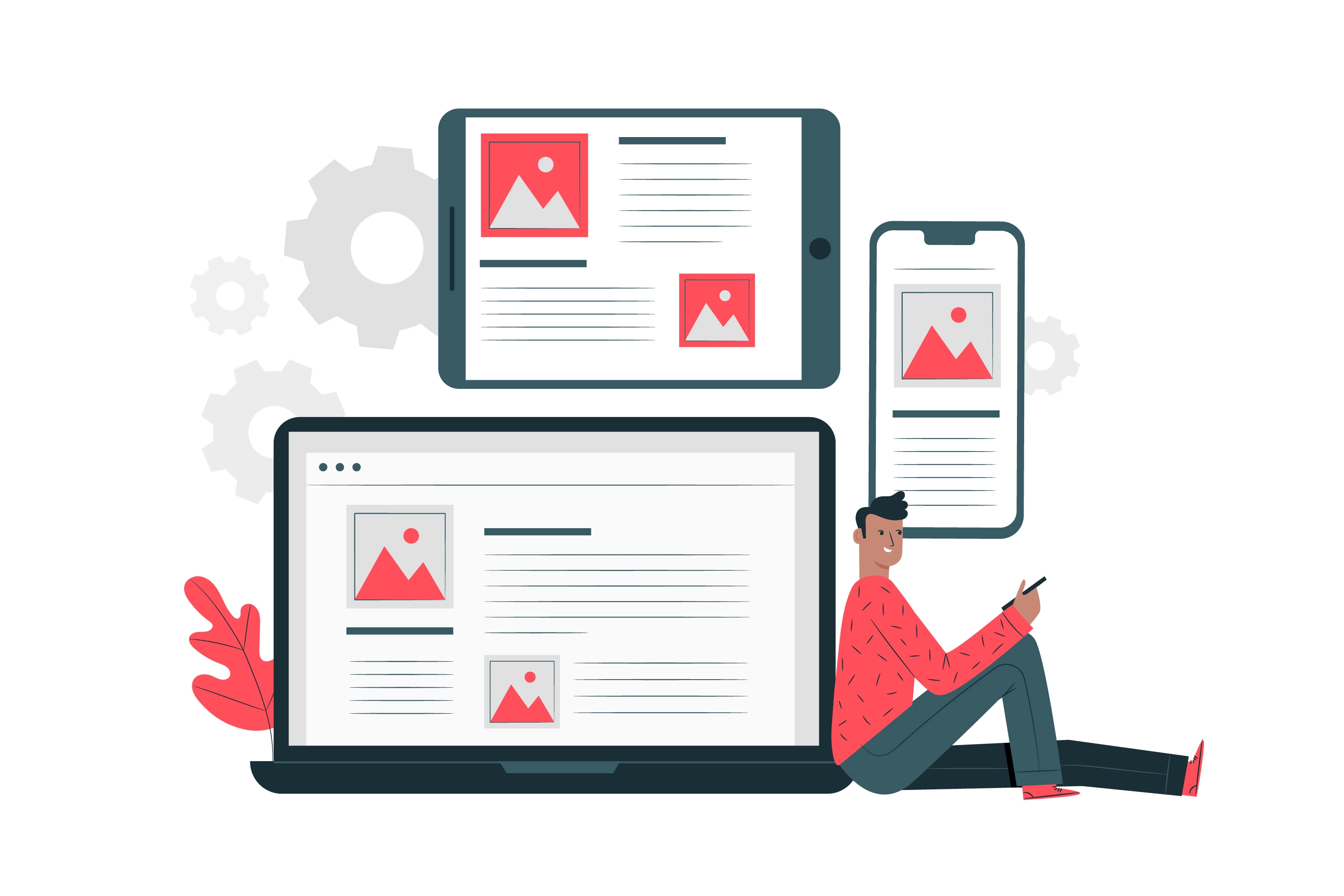
Step 1: Choose a responsive theme: Pick a WordPress theme that will resize itself to fit the size of the screen it is being viewed on. Your website will appear fantastic on all devices as a result.
Step 2: Image optimization is important since large images might slow down your website and make it difficult for mobile users to access. To ensure that your images load quickly and are smaller in file size, use image compression tools.
Step 3: Install a caching plugin: By saving frequently requested data in the user’s browser and preventing repeated server calls, caching plugins can make your site load faster.
Step 4: Employ typefaces that are easier to read on mobile devices and at smaller sizes by sticking with mobile-friendly fonts. To make it easier to read on small displays, avoid choosing too ornate or complicated typefaces.
Step 5: Navigation should be made simpler so that users of mobile devices may easily access it. Reduce the quantity of menu items and use labels that are clear and succinct.
Step 6: Use pop-ups sparingly or think about using a less invasive style, such as a banner or slide-in, as they can be annoying on mobile devices.
Step 7: Form optimization: Make sure your forms are simple to use and submit on mobile devices by using responsive form plugins.
Step 8: Employ mobile-friendly plugins: When choosing plugins for your website, make sure they are responsive to mobile devices and don’t cause your site to load slowly.
Step 9: Employ Accelerated Mobile Pages (AMP) to produce streamlined web pages that load rapidly on mobile devices. AMP is a Google-backed technology.
Step 10: Use a speed optimization plugin to make sure your website runs quickly on all devices.Optimize your site for speed. Users often find a slow site annoying.
Step 11: Test your website on several devices to ensure that it looks amazing and operates properly on desktop computers, tablets, and mobile devices.
You may build a WordPress site that is simple to use and available on all devices by putting these suggestions into practice.
Here are some examples of how you can implement some of the tips I mentioned using code:
1. Use a responsive theme:
<head>
  <meta name="viewport" content="width=device-width, initial-scale=1">
  <link rel="stylesheet" href="style.css">
</head>
This code includes a meta tag that tells the browser to adjust the width of the site to fit the screen size, making it responsive.
2. Optimize images:
add_filter( 'jpeg_quality', function( $arg ) {
    return 60;
});
With this code, JPEG image quality is decreased to 60, which can help with file size optimization and faster website load times.
3. Use a Caching plugin:
define( 'WP_CACHE', true );
By caching frequently requested data, WordPress cache, which is enabled by this code, can help speed up your website.
4. Use mobile-friendly fonts:
body {
  font-family: "Open Sans", sans-serif;
  font-size: 16px;
  line-height: 1.5;
}
The body text’s font family, size, and line height are set by this code to make it simple to read on mobile devices.
5. Simplify navigation:
<nav>
  <ul>
    <li><a href="#">Home</a></li>
    <li><a href="#">About Us</a></li>
    <li><a href="#">Services</a></li>
    <li><a href="#">Contact</a></li>
  </ul>
</nav>
This code shows a simple navigation menu with clear, concise labels and a limited number of menu items.
6. Minimize pop-ups:
<div class="banner">
  <p>Sign up for our newsletter</p>
  <a href="#" class="close">X</a>
</div>
This code shows a banner with a call to action and a close button instead of a pop-up.
7. Optimize your forms:
<form>
  <label for="name">Name:</label>
  <input type="text" id="name" name="name">
  <label for="email">Email:</label>
  <input type="email" id="email" name="email">
  <input type="submit" value="Submit">
</form>
This code shows a simple form with responsive input fields that are easy to use on mobile devices.
8. Use mobile-friendly plugins:
Choose plugins that are lightweight and don’t slow down your site on mobile devices.
9. Use Accelerated Mobile Pages (AMP):
Install and configure the AMP plugin to create AMP versions of your pages.
10. Optimize your site for speed:
add_action( 'after_setup_theme', 'setup_theme' );
function setup_theme() {
  add_theme_support( 'automatic-feed-links' );
  add_theme_support( 'title-tag' );
  add_theme_support( 'post-thumbnails' );
  add_image_size( 'medium', 300, 300, true );
  add_image_size( 'large', 1024, 1024, true );
}
This code sets up various features and optimizations to improve site speed, including adding post thumbnails and optimizing image sizes.
11. Test your site on multiple devices:
To make sure your site looks amazing and works properly on all devices, use a responsive design testing tool or manually test it on each one.
Conclusion:
Finally, in the current digital environment, building a WordPress site that is mobile-friendly is essential. You can make sure that your site is usable and accessible on all platforms by putting responsive design into practice, optimizing pictures, streamlining navigation, utilizing mobile-friendly fonts and plugins, and testing on various devices. Moreover, adopting strategies for speed optimization like caching, AMP, and picture size optimization can assist reduce page load times, resulting in a better user experience. Ultimately, having a mobile-friendly WordPress site is crucial for connecting with and engaging your audience while they are on the road. more info Contact Us


2 Comments
Your point of view caught my eye and was very interesting. Thanks. I have a question for you.
I don’t think the title of your article matches the content lol. Just kidding, mainly because I had some doubts after reading the article.